Direct Mail Examples Straight from the Pros

For direct marketers across the globe, designing creative direct mail that drives conversion is a top priority. More than 80% of Celtra research respondents reported that they are more likely to trust a brand with well-designed advertisements. So, if direct mail is part of your direct response strategy, developing a beautiful mail piece that will immediately gain audience trust, make a lasting impression, and encourage action, is key. When striving to meet these expectations, direct mail examples from seasoned creative directors may be especially valuable and inspirational.
Because online visitors are becoming increasingly numb to the content they see, your digital-only advertisements may feel a bit over-served. Although valuable, pop-up, display, and email marketing channels can not compete with direct mail’s response rates. It comes down to the cognitive power of holding your mail piece in their hands, something only a direct mail marketing campaign can provide.
To guide your next campaign’s creative approach, here are three performing direct mail examples and insights to why they work, straight from the pros.
Solo Direct Mail Example

Solo mail offers a wealth of opportunities for tailoring creative to your brand’s aesthetic and target audience. Your direct mail agency will use your brand style guide, audience demographics, and marketing strategy results to suggest design concepts that align with your brand and direct response best practices. They will leverage data and strategic experimentation to continue to learn what works best with your audience as your campaign and goals evolve.
Testing a variety of formats that fit the industry, concept, and strategy is particularly helpful in gaining targeted learnings to inform future creative decisions. Letter packages often perform stronger in the home warranty and insurance spaces, and retail/e-commerce brands typically see better results with self-mailer formats. With the rise in social media usage and the continued improvement of technology, attention spans are getting shorter. Therefore, it is critical that each piece of mail is intentional in capturing prospects’ attention quickly, while prioritizing the most important messaging to drive them to respond. According to Who’s Mailing What!, word count in mailers has declined by 62% in recent years. Our performance data is similar, finding mailers with short, easy-to-scan copy typically performs best across all formats.
But this isn’t to say that copy should be limited to a certain number of characters. The more compelling your narrative, the more of an impact you are going to have. You will experience the most success in a solo direct mail design by choosing formats that allow you to tell your greatest story. The main message is most effective when it follows the following formula: “You have this problem, here’s why our brand is the solution.”
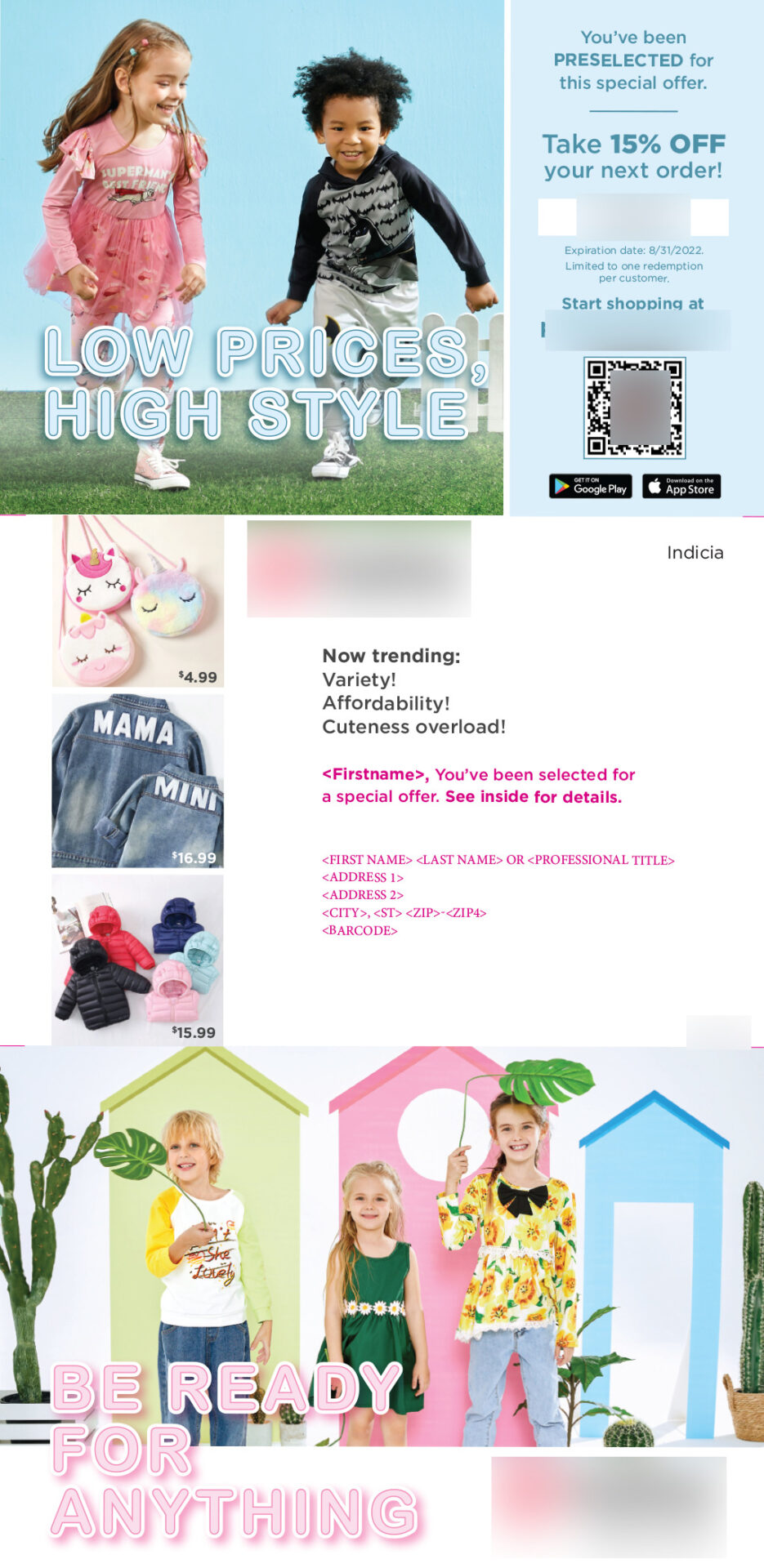
Why we love this solo direct mail example:
- Bright, lively colors and images that are reflective of the intended audience are used on the piece.
- A sense of urgency was created by including an expiration date for the offer.
- Above the address area, personalization (first name) has been added, which universally provides a lift in response rates.
- A QR code is included, which is an interactive and effective direct mail tool in marketing campaigns.
Shared Direct Mail Example

Also known as shared group mailers, coupon mailers, or marriage mail; it is good practice to create shared mailer designs that are harmonious. The colors and images on each direct mail piece should be consistent to provide a sense of continuity. It’s normal to fear getting lost in the crowd, but with shared mail, your brand can still be distinctive in a variety of ways.
There are specific strategies you can employ with shared mail to maximize your chances of winning over new customers. If the consumer is familiar with one of the brands in the envelope, the package is more likely to be opened. Therefore, it’s common for shared mail providers to place notable and recognized companies on the outer envelope to increase overall open rates. Once the consumer has opened the shared mail package, a clean, uncluttered design will guide them through each piece and naturally direct eyes to the critical information. You want them to be attracted to your CTAs and special offers, so work with your agency partner to determine what would drive the most response based on your industry, research, and brand goals.
If your brand can support an incentive offer, it is beneficial to conduct extensive direct mail testing across two main categories: lead generation and sales generation. Once you identify the one that works best for your good or service, continue to test with more lucrative incentives. Variables that can be tested include a percentage discount, a limited-time free trial or subscription, complementary services, a gift or “freemium,” or even no offer at all, such as “purchase now” or “don’t wait.” FOMO drives 60% of consumers to make purchases within 24 hours, so always imply urgency and exclusively with your design.
Why we love this shared direct mail example:
- Large, bolded lettering is eye-catching and used in the header to grab the reader’s attention.
- Offer placed in the bottom right corner of the mail piece where it reads, “25% off your first week + free delivery” to correspond with the natural pattern human eyes follow when viewing a mail piece.
- The call to action and offer are set apart from the rest of the content to draw the eyes toward it.
Automated Direct Mail Example


Automated mail can be used to reach your audience quickly and affordably. Since the production and mailing process moves faster than shared or solo strategies, brands may worry about creative restrictions. Luckily, this design approach can be flexible like solo mail. You can still build an engaging piece that features a motivating offer and an alluring CTA. There is also flexibility in the size of your postcard (although we recommend oversized postcards to drive the best response). Personalization is among the top creative techniques used in automated mailers. Variable fields such as name, phone number, address, and URLs can be customized to each contact directly in the automated mail platform.
With quick-turn leads mailings, you can use your own mail piece design or you can work with SeQuel’s creative team for development. The oversized postcard’s sophisticated and powerful format makes an impression that is sure to elicit response.
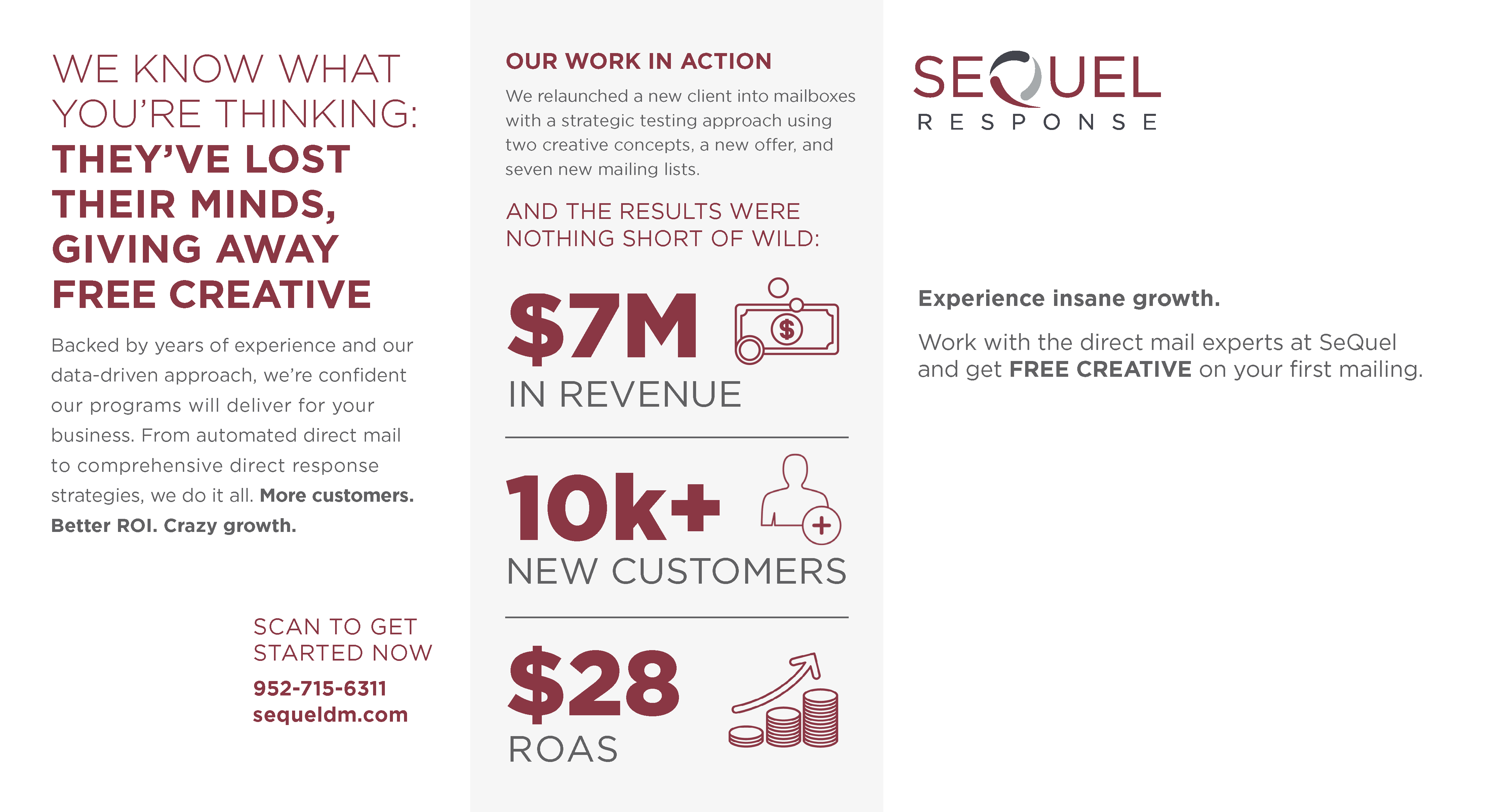
Why we love this automated direct mail example:
- Energetic visuals in a monochromatic scheme allows the messaging to be the hero for quick comprehension.
- Key information is bolded.
- Stats/numbers used as a form of social proof.
- The offer is repeated throughout the design.
- To motivate the audience to act, a QR code is included.
- Personalization (name) is leveraged.
When it comes to direct mail marketing, one of the most important things to remember is that the best creative is the creative that sells. Therefore, continuous creative testing is essential to sustaining performance in an evergreen mail program. Whether your strategy is shared, solo, automated, or a combination of all three, remember these direct mail examples when developing your next campaign.
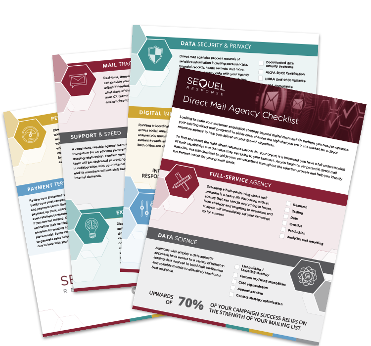
Do you want to design direct mail creative that sells? We’ve got you covered. Download our free e-book, or contact one of our expert strategists today.

